iOS app
Artyc
On a phone the chart is the control and one gesture has to return the value, the time, and whether it was acceptable.
On a phone the chart is the control and one gesture has to return the value, the time, and whether it was acceptable.
The short version
The Artyc app does two things. Set up a unit and check on one in the field. The person holding it is a driver at a loading dock or a technician provisioning four shippers before a run leaves.
The unit already has a screen, which is what keeps the scope small. The app exists for what that screen can't do: join a network, surface the detail behind an alert code, and answer "what temperature is it" when the shipper is in the back of a vehicle and you are inside a building. Everything the unit already shows well is not the app's job. Holding that line was most of the design work.
My role was to write the principles, design the screens, and build initial prototypes in SwiftUI.
Building rather than drawing mattered because the interesting behavior lives in the seams between software and hardware. A pairing that drops halfway through. A provisioning step nothing can confirm until data arrives a minute later. Those problems are hard to debate in a static frame and obvious the moment somebody is holding a running build.
Gen 1 is in production, built by the mobile engineer from these designs. Zero to one took a couple of months; it has been in the field for over a year since. Gen 2 is still a prototype. Built over a few weeks in the summer of 2026 and ready for usability testing.

The shipper has its own onboard display, so the phone's job is narrower than it looks. Answer the questions the box can't, like what's happening inside a vehicle you're not standing next to. Five degrees. Cold chain intact. Nothing to do.
The problem
The first instinct was a native version of the web portal. Everything is already designed and the data is there. That doesn't work because the two surfaces aren't for the same activity.
The portal is where you investigate: triage, troubleshooting, comparing runs, going deep. That work wants density, a mouse, and a chair. In the field you want to be told one thing and be able to act on it.
The harder problem is what's left over once "is it cold" has an answer. A number in range isn't interesting. A number out of range is a question about whether the payload is still usable, and that question has a regulatory answer attached to it. The app either carries that weight properly or hands it back to the portal.
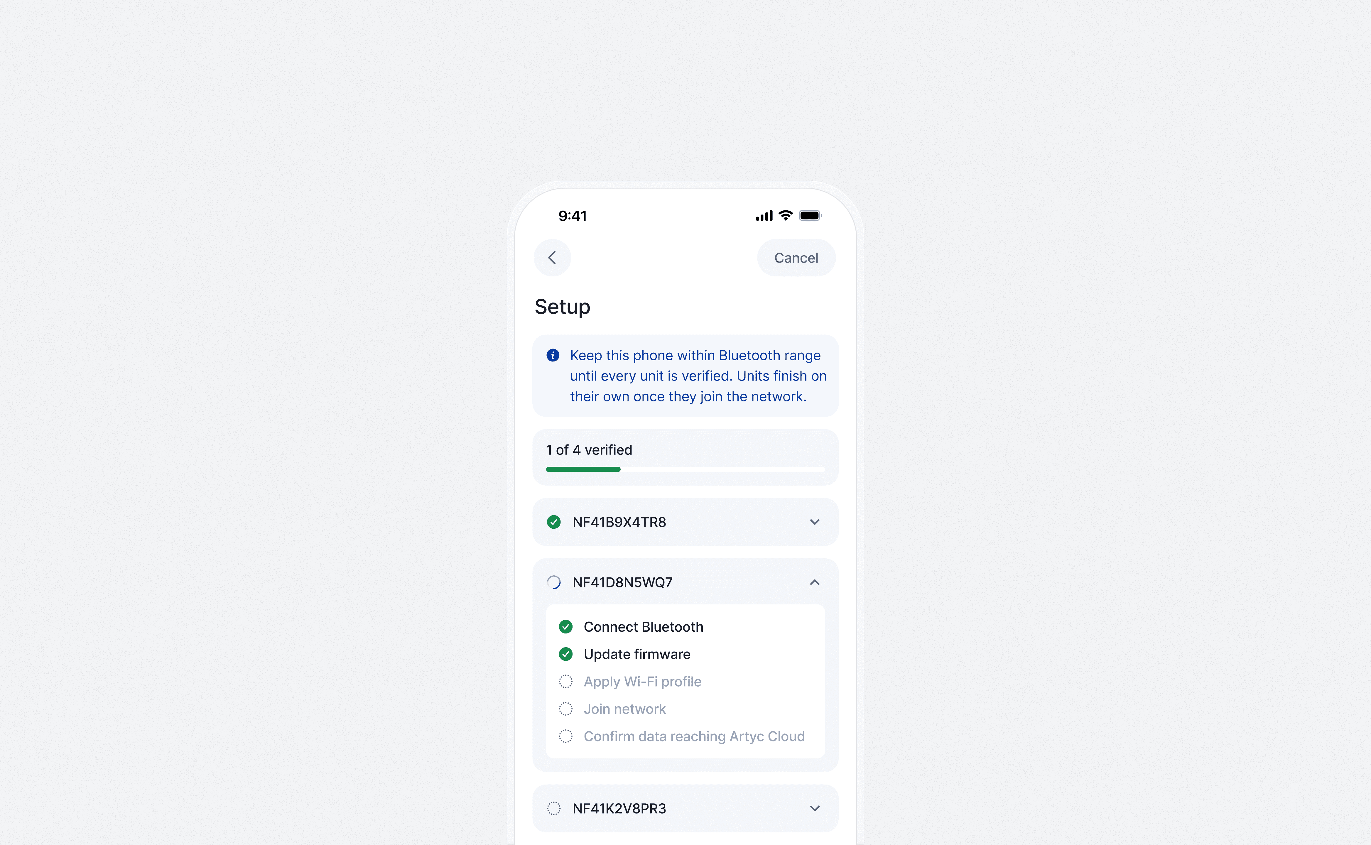
Version one of the app was a simple pairing procedure. Find the units, get them onto Wi-Fi.
The approach
Gen 1 was built from scratch, so most of the approach was finding the edges before drawing anything.
One of those edges are set by the hardware. I sat with firmware to establish what a unit can actually say over Bluetooth and what it can't, which determines how much of setup is possible on a phone at all.
The other came from the field. A technician provisioning a batch before a run and a driver checking a shipper left in a vehicle are two different jobs with different amounts of attention to spare. Setup can assume both hands and a few minutes. Everything else has to assume one hand and a few seconds.
The first release cut deeper than both jobs. It had no live temperature at all. It configured a unit and got it onto Wi-Fi, and that was the whole app, because Wi-Fi is the only path for data when a unit isn't on cellular, and nothing downstream matters until data flows. Checking came in the iterations after, once provisioning was stable.
Reading a temperature trace with one hand
The trickiest screen in the next iteration is run detail. All the data from a completed journey, on a phone, in a format a quality reviewer will actually read. The portal answers this with a chart you interrogate, surrounded by controls. On a phone the chart is the control, and one gesture has to return the value, the time, and whether it was acceptable.
The numbers a person would have zoomed in to find are printed: minimum, maximum, mean kinetic temperature, and what the run cost in battery. MKT is the one number that captures accumulated heat exposure across a whole run; a quality reviewer asks for it by name, and it's the only figure on the screen that can't be read directly off the trace.
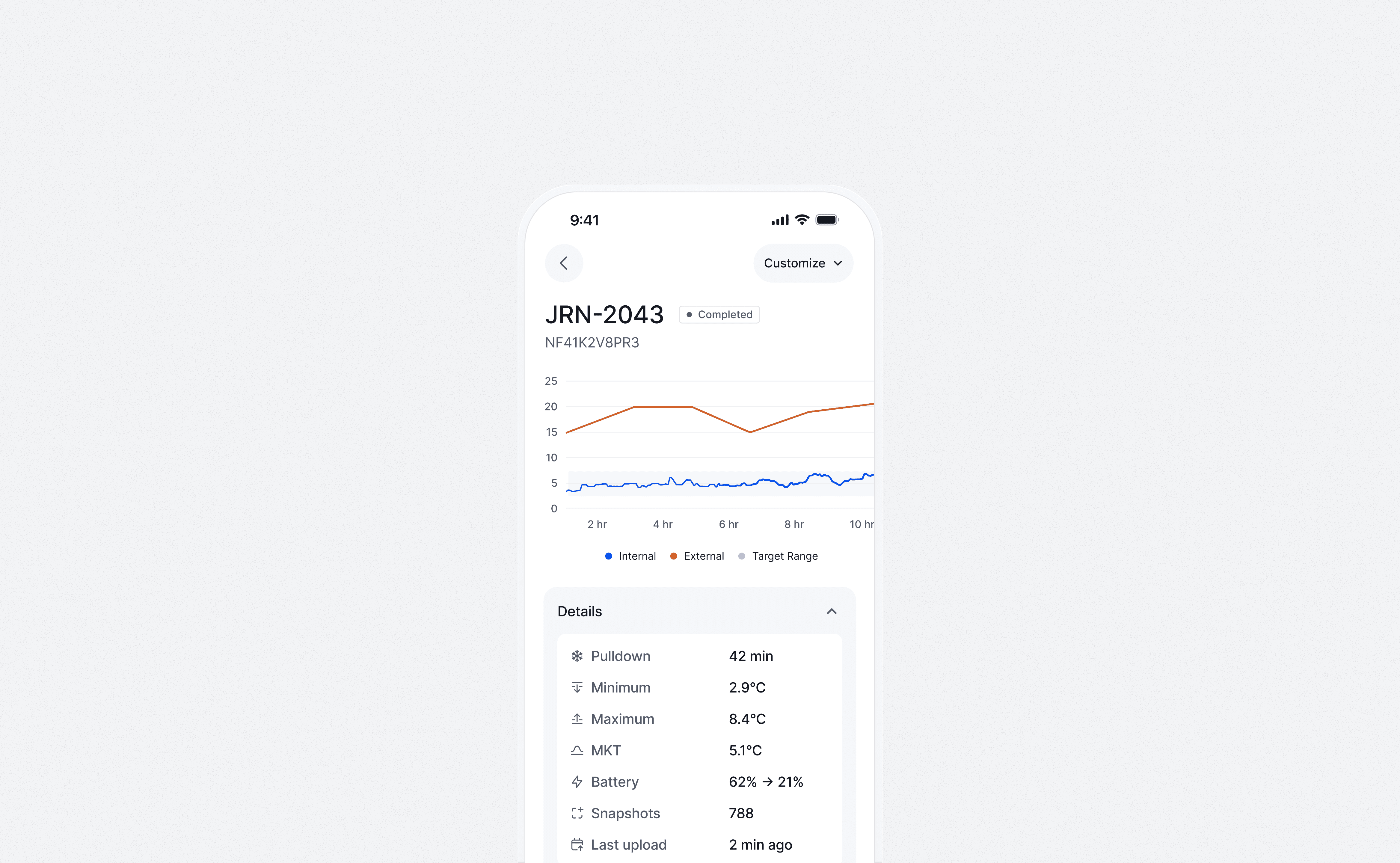
Eight hours of transit, 788 sensor readings, a maximum recorded temperature of 8.4°C, and a mean kinetic temperature calculated across the full run. MKT is the number a quality reviewer asks for by name when deciding whether a payload is still usable.
What landed
Gen 1 is home, setup, unit detail, and alerts. Home holds a queue of what needs a person and a summary of what is simply running, and nothing else, because the moment a chart lands on it the app has started competing with the portal.
Gen 2 is exploring what comes after, built to be discussed and not to ship. The prototypes exist because the loop that builds them is AI-assisted. I'm not a SwiftUI developer by trade. The workflow turns design intent into running Swift fast enough to experiment with, which is how one designer keeps working prototypes moving beside production work.
Gen 1 has been in production for over a year, mostly with medical couriers, the primary market for Artyc's 5-L unit.
Provisioning went from one unit at a time to a batch, the phone holding a Bluetooth session open while each unit works through its own checklist.
A three-month pilot with a Texas medical courier included six units, 172 journeys, and 1,506 hours of cooling. In ambient conditions up to 141°F, a unit set to -20°C drifted to -16°C and no further. With lid opens, set points, and charge levels logged on every journey, the ops team started coaching drivers from data instead of assumption.
Preventable driver issues fell 74%, from 9 in the first 60 journeys to 4 in the following 112. The n is small so I'd call it directional rather than proven.
Alerting moved into the app instead of living only in the portal. Getting it the rest of the way to the person, with push and lock-screen actions, is the piece still ahead.

Early drafts had one health score. A good battery averages out a drifting sensor and the screen tells you everything is fine. Firmware, calibration, board test and environment now report separately so nothing is hidden.
What I’d do differently
A single health score is convenient to show and dangerous to act on. Averaging subsystems lets a healthy battery hide a drifting sensor, and the unit goes out anyway. Early drafts of this screen carried a big score with a recommendation under it. The current design refuses the number altogether. In its place, two figures that don't lie, and the state of each record that matters: firmware, calibration, board test, environment.
What replaced the score is history, because health is a snapshot and the question people actually ask is historical. Has this unit always run warm. Which board revision is it on, and did anything change after the last firmware update. On the web we answered that with a unit passport: one page carrying everything that has ever happened to a shipper, each row written by the workflow that produced it. The unresolved part for mobile is how much history is worth carrying to a unit that may be offline, and which events still deserve a row once the list is three years long.

The chips filter the numbers. The alert queue ignores them. What needs a person does not wait on a date range.
What’s still open
The question Gen 2 exists to answer is what a phone can do that a laptop in an office cannot, and we don't have the full answer yet. The candidates come down to proximity: being near enough to the unit to do something about it. Anything that doesn't need that is portal work wearing a mobile layout.
So the next move is field feedback, not more screens. Four things sit sketched and unbuilt, and the order between them is a roadmap question, not a design one: push notifications with lock-screen actions, geofenced arrival detection, offline queueing for dead zones, and consignee tracking links for people without accounts.
The prototype raised my own appetite for the layer above. The long arc, for me, is the app growing into a real native counterpart to the web portal, which sounds like the problem section calls a failure. The difference is order. Port first and you never learn the field jobs. Earn the field jobs first, the way Gen 1 did by shipping Wi-Fi setup alone, and parity becomes a destination instead of a starting point.
Note: To respect confidentiality and regulatory compliance, interface images are built against the product's own design system and populated with fixture data. No customer records, colleague names, or partner names appear anywhere in this case.
iOS app
Artyc
On a phone the chart is the control and one gesture has to return the value, the time, and whether it was acceptable.
On a phone the chart is the control and one gesture has to return the value, the time, and whether it was acceptable.
The short version
The Artyc app does two things. Set up a unit and check on one in the field. The person holding it is a driver at a loading dock or a technician provisioning four shippers before a run leaves.
The unit already has a screen, which is what keeps the scope small. The app exists for what that screen can't do: join a network, surface the detail behind an alert code, and answer "what temperature is it" when the shipper is in the back of a vehicle and you are inside a building. Everything the unit already shows well is not the app's job. Holding that line was most of the design work.
My role was to write the principles, design the screens, and build initial prototypes in SwiftUI.
Building rather than drawing mattered because the interesting behavior lives in the seams between software and hardware. A pairing that drops halfway through. A provisioning step nothing can confirm until data arrives a minute later. Those problems are hard to debate in a static frame and obvious the moment somebody is holding a running build.
Gen 1 is in production, built by the mobile engineer from these designs. Zero to one took a couple of months; it has been in the field for over a year since. Gen 2 is still a prototype. Built over a few weeks in the summer of 2026 and ready for usability testing.
The shipper has its own onboard display, so the phone's job is narrower than it looks. Answer the questions the box can't, like what's happening inside a vehicle you're not standing next to. Five degrees. Cold chain intact. Nothing to do.
The problem
The first instinct was a native version of the web portal. Everything is already designed and the data is there. That doesn't work because the two surfaces aren't for the same activity.
The portal is where you investigate: triage, troubleshooting, comparing runs, going deep. That work wants density, a mouse, and a chair. In the field you want to be told one thing and be able to act on it.
The harder problem is what's left over once "is it cold" has an answer. A number in range isn't interesting. A number out of range is a question about whether the payload is still usable, and that question has a regulatory answer attached to it. The app either carries that weight properly or hands it back to the portal.
Version one of the app was a simple pairing procedure. Find the units, get them onto Wi-Fi.
The approach
Gen 1 was built from scratch, so most of the approach was finding the edges before drawing anything.
One of those edges are set by the hardware. I sat with firmware to establish what a unit can actually say over Bluetooth and what it can't, which determines how much of setup is possible on a phone at all.
The other came from the field. A technician provisioning a batch before a run and a driver checking a shipper left in a vehicle are two different jobs with different amounts of attention to spare. Setup can assume both hands and a few minutes. Everything else has to assume one hand and a few seconds.
The first release cut deeper than both jobs. It had no live temperature at all. It configured a unit and got it onto Wi-Fi, and that was the whole app, because Wi-Fi is the only path for data when a unit isn't on cellular, and nothing downstream matters until data flows. Checking came in the iterations after, once provisioning was stable.
Reading a temperature trace with one hand
The trickiest screen in the next iteration is run detail. All the data from a completed journey, on a phone, in a format a quality reviewer will actually read. The portal answers this with a chart you interrogate, surrounded by controls. On a phone the chart is the control, and one gesture has to return the value, the time, and whether it was acceptable.
The numbers a person would have zoomed in to find are printed: minimum, maximum, mean kinetic temperature, and what the run cost in battery. MKT is the one number that captures accumulated heat exposure across a whole run; a quality reviewer asks for it by name, and it's the only figure on the screen that can't be read directly off the trace.
Eight hours of transit, 788 sensor readings, a maximum recorded temperature of 8.4°C, and a mean kinetic temperature calculated across the full run. MKT is the number a quality reviewer asks for by name when deciding whether a payload is still usable.
What landed
Gen 1 is home, setup, unit detail, and alerts. Home holds a queue of what needs a person and a summary of what is simply running, and nothing else, because the moment a chart lands on it the app has started competing with the portal.
Gen 2 is exploring what comes after, built to be discussed and not to ship. The prototypes exist because the loop that builds them is AI-assisted. I'm not a SwiftUI developer by trade. The workflow turns design intent into running Swift fast enough to experiment with, which is how one designer keeps working prototypes moving beside production work.
Gen 1 has been in production for over a year, mostly with medical couriers, the primary market for Artyc's 5-L unit.
Provisioning went from one unit at a time to a batch, the phone holding a Bluetooth session open while each unit works through its own checklist.
A three-month pilot with a Texas medical courier included six units, 172 journeys, and 1,506 hours of cooling. In ambient conditions up to 141°F, a unit set to -20°C drifted to -16°C and no further. With lid opens, set points, and charge levels logged on every journey, the ops team started coaching drivers from data instead of assumption.
Preventable driver issues fell 74%, from 9 in the first 60 journeys to 4 in the following 112. The n is small so I'd call it directional rather than proven.
Alerting moved into the app instead of living only in the portal. Getting it the rest of the way to the person, with push and lock-screen actions, is the piece still ahead.
Early drafts had one health score. A good battery averages out a drifting sensor and the screen tells you everything is fine. Firmware, calibration, board test and environment now report separately so nothing is hidden.
What I’d do differently
A single health score is convenient to show and dangerous to act on. Averaging subsystems lets a healthy battery hide a drifting sensor, and the unit goes out anyway. Early drafts of this screen carried a big score with a recommendation under it. The current design refuses the number altogether. In its place, two figures that don't lie, and the state of each record that matters: firmware, calibration, board test, environment.
What replaced the score is history, because health is a snapshot and the question people actually ask is historical. Has this unit always run warm. Which board revision is it on, and did anything change after the last firmware update. On the web we answered that with a unit passport: one page carrying everything that has ever happened to a shipper, each row written by the workflow that produced it. The unresolved part for mobile is how much history is worth carrying to a unit that may be offline, and which events still deserve a row once the list is three years long.
The chips filter the numbers. The alert queue ignores them. What needs a person does not wait on a date range.
What’s still open
The question Gen 2 exists to answer is what a phone can do that a laptop in an office cannot, and we don't have the full answer yet. The candidates come down to proximity: being near enough to the unit to do something about it. Anything that doesn't need that is portal work wearing a mobile layout.
So the next move is field feedback, not more screens. Four things sit sketched and unbuilt, and the order between them is a roadmap question, not a design one: push notifications with lock-screen actions, geofenced arrival detection, offline queueing for dead zones, and consignee tracking links for people without accounts.
The prototype raised my own appetite for the layer above. The long arc, for me, is the app growing into a real native counterpart to the web portal, which sounds like the problem section calls a failure. The difference is order. Port first and you never learn the field jobs. Earn the field jobs first, the way Gen 1 did by shipping Wi-Fi setup alone, and parity becomes a destination instead of a starting point.
Note: To respect confidentiality and regulatory compliance, interface images are built against the product's own design system and populated with fixture data. No customer records, colleague names, or partner names appear anywhere in this case.