Tiara
The simplest way to start investing

The short version
Most people who aren't investing assume the barrier is money. Usually it's that the market got explained to them as something you watch, and nobody wants a second full-time job. Tiara buys the S&P 500 in whatever amount you have and then asks nothing else of you.
I built the brand, created the design system, made the flows and screens, and drew up a product roadmap. Alex built it. React Native, the full backend architecture, Alpaca broker-dealer integration, KYC flows, security, and everything the regulators require before real money moves.
There's no chart on the home screen. That took a lot longer to defend than it did to design, and defending it is most of what this case is about.
Where it stands. Built, with broker-dealer integration live in a sandbox. I designed the product and the system, then handed it off. A separate team is taking it to launch. I'm not involved day to day.

How it started
I imagined a large portion of U.S. adults were already in the market through a 401k. But a workplace plan is an offer and plenty of people never get one.
The people I ended up talking to, through research and friends of friends, weren't waiting for a better moment. They needed their money soon, and they'd decided that whatever they could spare was too small to count.
So you never need to put in an amount that matters. Small, whenever you can, and then leave it. We chose the S&P 500 because it's the benchmark. In fact, over 90% of active fund managers fail to beat it over a 10-year period.
Holding is the whole habit. A product that promotes holding shouldn't be built out of parts that reward checking.

Making it
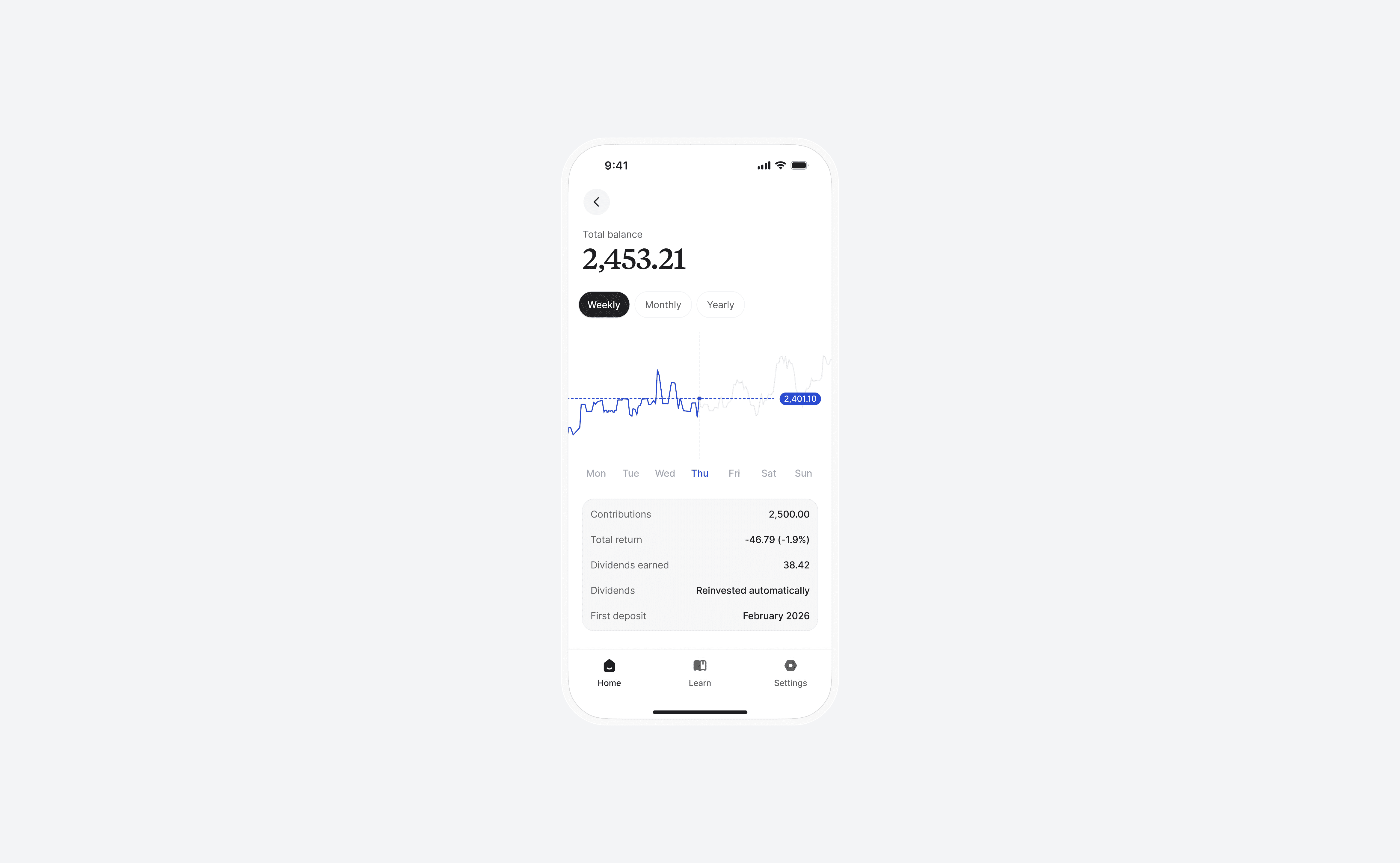
That's how the home screen lost its market chart. A stock app should have a chart the way a weather app has a temperature, and every draft tried to put one back. My own spec review caught a late design leading with a performance line, which is the exact thing a holder can't control, against the product's own written principle.
What sits there instead is a chart of contributions: monthly bars of what you put in, because that's the only number on the screen you decide. The market chart lives one tap deeper for whoever wants it.
We took it far enough in the marketing to say we're the only app that doesn't want you to look at it, which is either a good line or a very expensive one.
The PRD writes the anti-goal as a number, in a category that counts engagement as the win. Median app opens, two a month or fewer. Every screen has to serve a four-word loop: understand, trust, automate, check less.
The part I hadn't done before was compliance. Getting an Alpaca integration right means know-your-customer forms, disclosures, and policies a person has to read and agree to before they can continue.
Onboarding is where all of that lands at once, on a person who is already tense about money, being asked for a lot of personal information by an app they downloaded ten minutes ago.
Originally we'd built a compliance funnel rather than an activation experience. Every gram of friction sat before the user felt any value. The fix was to change the order. Value first, friction after, same number of screens.
The SSN step gained the one line that defuses its real fear: that this won't affect your credit score. A projection screen showing your money in twenty years got cut entirely, because it trips the SEC's marketing rule and edges toward hype, and hype is the competitor here.
The growth question sat in the back of my mind the whole build. The temptation is to add products. That's the robo-advisor move, and the opposite of the hypothesis. Anything that ever joins the S&P 500 has to be another long-horizon vehicle, a 401k-shaped thing, or it stays out.
The rest of it
What I got wrong
Early on, the design system. By being too disciplined about the right thing.
I built it around simplicity and got sterility. Clean, correct, and cold, in a product whose whole job is making a nervous person feel like they belong.
The fix was a serif, warmer neutrals, duotone icons, copy that sounds like a person. Catching it late is the part that stings, because the sterile version had already been through enough review that nobody was looking at it freshly anymore, including me.
What I learned
A removal has to be defended forever. Taking the chart off the home screen was one afternoon. Keeping it off ran the length of the project, because every draft finds an honest-looking reason to put it back. Written principles are how you argue with your own future drafts, and mine caught me twice.
In a compliance flow, order beats count. We cut nothing from onboarding and it got materially better. I'd stopped asking how many screens and started asking what the person had received by the time each one arrived.
Where it landed
Built, with broker-dealer integration live in a sandbox. The team is raising to go live.
If analytics show people pushing into the chart page daily, or support fills with requests for trend views, the home screen has become a door and the argument failed.


Tiara
The simplest way to start investing
The short version
Most people who aren't investing assume the barrier is money. Usually it's that the market got explained to them as something you watch, and nobody wants a second full-time job. Tiara buys the S&P 500 in whatever amount you have and then asks nothing else of you.
I built the brand, created the design system, made the flows and screens, and drew up a product roadmap. Alex built it. React Native, the full backend architecture, Alpaca broker-dealer integration, KYC flows, security, and everything the regulators require before real money moves.
There's no chart on the home screen. That took a lot longer to defend than it did to design, and defending it is most of what this case is about.
Where it stands. Built, with broker-dealer integration live in a sandbox. I designed the product and the system, then handed it off. A separate team is taking it to launch. I'm not involved day to day.
How it started
I imagined a large portion of U.S. adults were already in the market through a 401k. But a workplace plan is an offer and plenty of people never get one.
The people I ended up talking to, through research and friends of friends, weren't waiting for a better moment. They needed their money soon, and they'd decided that whatever they could spare was too small to count.
So you never need to put in an amount that matters. Small, whenever you can, and then leave it. We chose the S&P 500 because it's the benchmark. In fact, over 90% of active fund managers fail to beat it over a 10-year period.
Holding is the whole habit. A product that promotes holding shouldn't be built out of parts that reward checking.
Making it
That's how the home screen lost its market chart. A stock app should have a chart the way a weather app has a temperature, and every draft tried to put one back. My own spec review caught a late design leading with a performance line, which is the exact thing a holder can't control, against the product's own written principle.
What sits there instead is a chart of contributions: monthly bars of what you put in, because that's the only number on the screen you decide. The market chart lives one tap deeper for whoever wants it.
We took it far enough in the marketing to say we're the only app that doesn't want you to look at it, which is either a good line or a very expensive one.
The PRD writes the anti-goal as a number, in a category that counts engagement as the win. Median app opens, two a month or fewer. Every screen has to serve a four-word loop: understand, trust, automate, check less.
The part I hadn't done before was compliance. Getting an Alpaca integration right means know-your-customer forms, disclosures, and policies a person has to read and agree to before they can continue.
Onboarding is where all of that lands at once, on a person who is already tense about money, being asked for a lot of personal information by an app they downloaded ten minutes ago.
Originally we'd built a compliance funnel rather than an activation experience. Every gram of friction sat before the user felt any value. The fix was to change the order. Value first, friction after, same number of screens.
The SSN step gained the one line that defuses its real fear: that this won't affect your credit score. A projection screen showing your money in twenty years got cut entirely, because it trips the SEC's marketing rule and edges toward hype, and hype is the competitor here.
The growth question sat in the back of my mind the whole build. The temptation is to add products. That's the robo-advisor move, and the opposite of the hypothesis. Anything that ever joins the S&P 500 has to be another long-horizon vehicle, a 401k-shaped thing, or it stays out.
The rest of it
What I got wrong
Early on, the design system. By being too disciplined about the right thing.
I built it around simplicity and got sterility. Clean, correct, and cold, in a product whose whole job is making a nervous person feel like they belong.
The fix was a serif, warmer neutrals, duotone icons, copy that sounds like a person. Catching it late is the part that stings, because the sterile version had already been through enough review that nobody was looking at it freshly anymore, including me.
What I learned
A removal has to be defended forever. Taking the chart off the home screen was one afternoon. Keeping it off ran the length of the project, because every draft finds an honest-looking reason to put it back. Written principles are how you argue with your own future drafts, and mine caught me twice.
In a compliance flow, order beats count. We cut nothing from onboarding and it got materially better. I'd stopped asking how many screens and started asking what the person had received by the time each one arrived.
Where it landed
Built, with broker-dealer integration live in a sandbox. The team is raising to go live.
If analytics show people pushing into the chart page daily, or support fills with requests for trend views, the home screen has become a door and the argument failed.